Introductory Post
Hi, My Name is Louis and I am a 17 year old male studying towards my A Levels at the Latymer School, North London. I study History, English and Media.
My Candidate Number is 0131, and I am part of group 5, alongside Josh Brooks (0110), Vivian Oparah (0621) and Sebastian Hodge (0330).
You can use the labels section on the right hand side of the page to easily navigate my blog, with separate sections for AS, A2, Coursework and Preliminary tasks.
Furthermore there is a link to my school's Media Blog Archive on the right, where you can access all other blogs made at The Latymer School.
Thank you for viewing my blog, I hope you enjoy my work.
Our Music Video
Our Music Video
Group 5 Twitter and Facebook Live Link List
Sunday, 25 January 2015
Thursday, 11 December 2014
Q1. In what ways does your product use, develop or challenge forms and conventions of real media products?
Our main product is the debut music video for an artist of the Electronic/ Alternative Genre. This performance-based video introduces the artist to their intended audience. It also simultaneously interweaves a narrative poignantly charting the breakdown of a relationship to maximise audience engagement. The switch between narrative and performance is achieved through a change of video style, from HD studio footage, to home-recording style VHS camcorder footage. The music video utilises a range of conventions, most notably those designed to match the genre.
Relationship between Lyrics, Visuals and Music
Andrew Goodwin, author of Dancing in the Distraction Factory, identified that 'Music Videos demonstrate genre characteristics'. Using Goodwin's Theory on the Key features of music video, we were able to conform to, as well as challenging, and developing, the key conventions. Goodwin lists key features of a music video. We applied six of these principles within our own video:
1. Genre characteristics
Our chosen genre was Electronic Alternative. In order to reflect this we followed the characteristic of band image, using alternative costume and style applied by similar artists of the genre:
 |
| COSTUME DETAIL - Fka Twigs Promo shot |
 |
| Close up of the artists face paint |
 |
| Visual detail: face paint and tribal jewellery |
We also observed that within the electronic genre it is common for artist to be presented in futuristic, imposing 'high fashion' clothing to reflect the modern, futuristic style of music as demonstrated by AlunaGeorge. We developed this convention even further as our artists are not solely electronic artists, playing with this idea to create black and white costumes to present the stylised, modern artist image.
 |
| AlunaGeorge in 'high fashion' wear |
When focusing upon the alternative electronic sub-genre, we noticed that a very common theme among music videos was the use of monochrome styling. We drew inspiration from this, applying it within our own video:
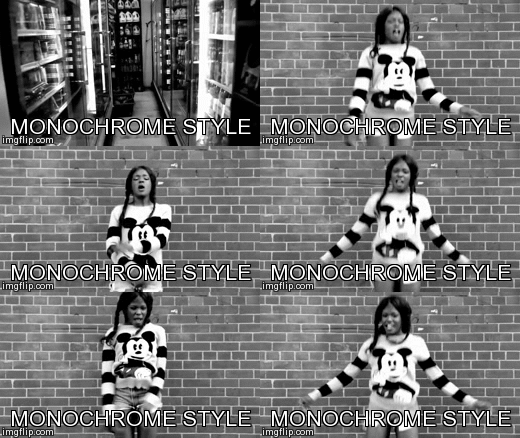 |
| Azealia Banks- '212' influenced our use of black and white elements |
2.Relationship between visuals and lyrics
We further conformed to the convention of visuals reflecting the lyrics of the song drawing inspiration from similar artists such as Sam Smith. In his sad, heartfelt song 'stay with me' there is a focus on his somber actions and sad face to reflect the lyrics "Why am I so emotional?". Through the expression of emotion within the lyrics and supporting visuals, music videos are no longer just a form of entertainment, but also a way for the audience to identify their own problems within the music, and build a relationship with the artist.
 |
| Sam Smith - 'Stay with me' employs a clear link between lyrics and visuals |
We used this within our video, particularly in the narrative sections:
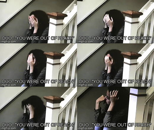 |
| An example of linking visuals and lyrics in our video |
3.Relationship between music and visuals
When analysing the editing of music videos, we noticed that the electronic genre in particular often used specifically timed cuts within videos in order to emphasise the climax of the song in order to enthrall the audience and capture the explosive emotion of the song.
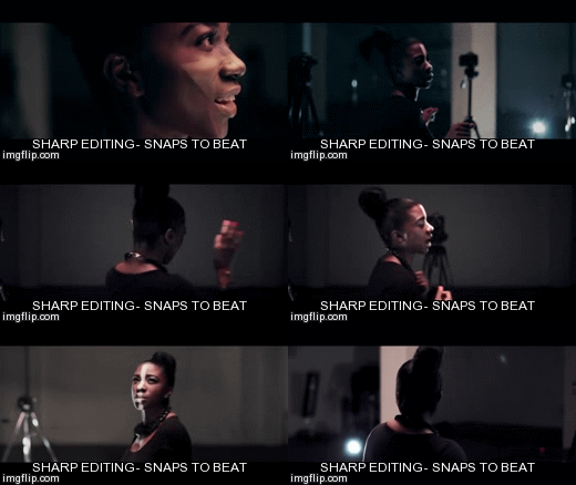 |
| SBTRKT- Pharoahs |

 |
| We used snapping to the beat to contrast the two sets and artist identities |
Within SBTRKT's 'Pharaohs', not only does the editing emphasise the beat of the song, but it also reflects the 'dance' style, promoting its upbeat message and provoking a response within the audience to dance. We did not use this in quite the same way for our video- more as a reflection of the relationship between the two singers.
However, we developed this convention by including our own unique twist. We decided that the time when there was no vocals would generally be when the narrative plays, therefore showing a clear separation from artist and actors. As a debut video, we needed to ensure that the actual artists were clearly highlighted for the majority of the duration of the video.
4. Close-ups of the artist - star image motifs/ representation of the artist
Appeal to Target Audience - Dyer's Star Theory
Film Studies Professor Richard Dyer states that 'pop stars' are:
- Artificial images, similar to any fictional construction- even if they are represented as 'real people' or authentic musicians
- Have a lasting significance and cultivate brand awareness over a period of time amongst a wide market
We tried to conform to this theory by creating NTLS as role models, both within the video and across all NTLS products. Within the video in particular, we used star imagery to reflect the duo as admirable role models for the audience to look up to. We achieved this through the repeated use of close ups of the artist:
 |
| Use of star image theory through close ups in Zoo Kid- 'Out Getting Ribs' |
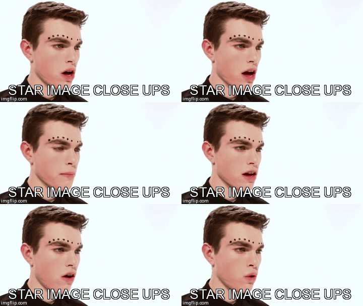 |
| Close ups in our video presented our artists identity |
 |
| Close ups in Telana's - 'Gemini' |

5. Visual References
We did not include inter-textual reference within our video, however, we arguably developed this convention by including various real life locations and situations that the audience could relate to:
 |
| London as represented in Magnetic Man - 'Getting nowhere' |
 |
| Iconographic London Location in our Video |
We included a relationship break-up scene within our video in order to not only reflect upon the real issue of love, but also added an element of Todorov's narrative etheory to the video by creating a disequilibrium
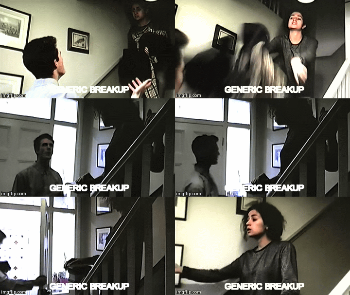 |
| The breakup scene in our video |
 |
| A break up scene in a similar unofficial music video |
6. Narrative or concept based video performance
We decided we would stick with the convention among narrative videos in showing more of the artist than the narrative, as the purpose of our video was to sell the debut artist and their music :
When studying similar electronic/alternative artists, we noticed that the most effective videos were rather simple in narrative, mainly focusing n the performance of the artist, however, supported by bold visuals to match the modern, futuristic sounds of the music- as shown below:
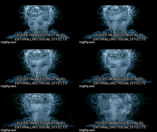 |
| Grimes- Nightmusic |
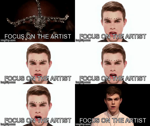 |
| Shots focusing on the artist in our video, with editing adding emphasis on their identities |
This is also effective in reinforcing the star image of artists. Putting faces to the voices seeks to attract the audience to the way the artist looks, alongside their musical ability. In Grimes's video, the use of digital effects seems to hypnotise and engage the viewer, highlighting her appearance as angelic and individual. Whereas in our video, although we used this for its star abilities, we focused more on introducing the faces of the artists and selling them to the audience.
However, we decided that a totally narrative style of video would not represent the artists at all and therefore we decided to develop the convention by presenting a narrative alongside the artists. In doing this we drew inspiration from The 1975- 'Settle Down' Music Video, where the narrative is interlinked with presentation of the band:
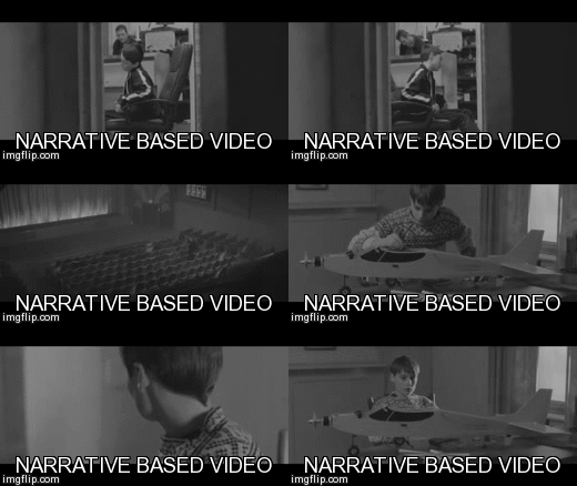 |
| The 1975- 'Settle Down' |
Although we liked the idea of having both narrative and artist in the same shot- with the band as the narrators, we felt that this would be too complicated to achieve effectively at our level, therefore challenged this convention by separating narrative and performance. By contrasting two completely different visual formats there was a clear distinction between the era in which the footage was set - with the performance clearly current, and the analog VHS footage showing a tale of love in a past time.
8. Voyeurism
We attempted to include an aspect of voyeurism by presenting the artists both together and separately, in order to reflect their relationship. This hints at a tension between the two singers and allows the audience to relate to their uncertainties and find a real person within the NTLS image.
Visual Influences
VHS
One of the biggest ways in which we challenged the conventions of a typical professional music video was by using analog footage captured on my VHS camcorder. We were influenced by a couple of other recent music videos whom have employed the style, and we felt that this would be a nice artistic and visually appealing way of presenting the narrative.
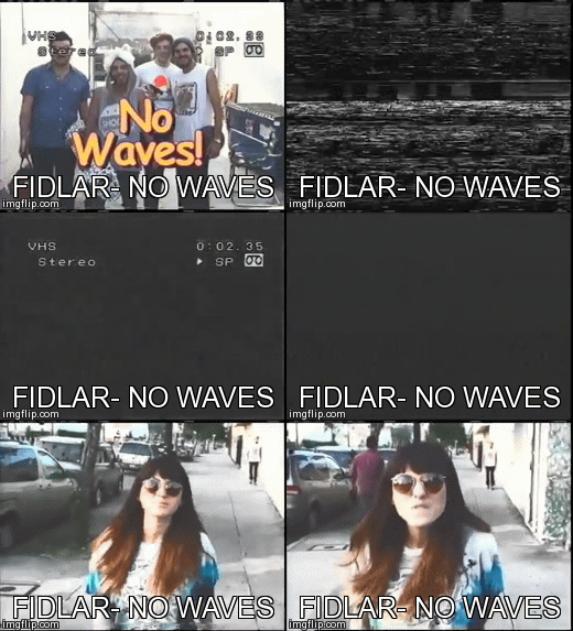 |
| We were inspired by music videos which had been shot completely on VHS cameras |
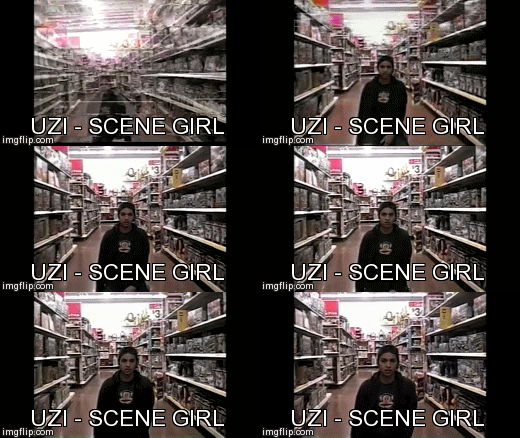
VHS has seen a recent resurgence in alternative music videos: Three I was influenced by being Chase and Status - Blind Faith, UZI- Scene Girl and Fidlar - NO Waves. All three seem to use the style to create a nostalgic, amateur home video feel. However, it is Blind Faith which is most effective, using the camera to literally go back in time to create a 90's rave party scenario. Although we did not use the VHS to replicate a 90's environment, we certainly created the feeling of events from the past- creating the impression that the troubled relationship has long passed.
Director case study: Daniel Wolfe
When researching music videos for ideas, I was particularly drawn to the work of Daniel Wolfe, an award winning music video and short film producer who employs his individual artistic styles into his work.
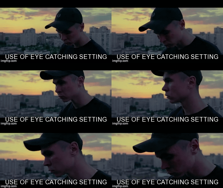
I particularly liked the use of shots from behind to give the feel that the audience is within the action, following the subject. We were able to employ this technique in our own video when following the couple on their dates.
 |
| Another Video shot by Daniel Wolfe for 'The Shoes' |
Another convention we particularly liked was the stylistic technique of using a white backdrop and bright clear lighting to create the illusion of an infinity backdrop within the studio. An example of this is in FKA Twigs' video 'Throughtheglass'. We conformed to this stylistic convention using the studio and creating a perfect white backdrop in order to produce the desired effect, as well as further developing it by also contrasting this with an infinity black backdrop:
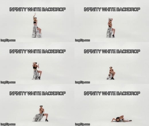 |
| FKA Twigs - Throughtheglass |
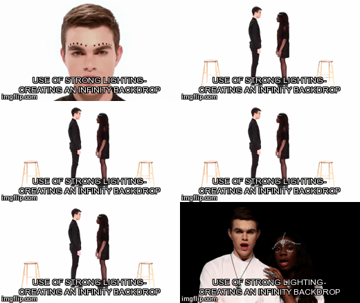
Visual References
Press play in the window below in order to view a Mind map presentation exploring the various visual focuses we drew upon within our video, and what they signify:
Mind Map created by Joshua “Latymerm with ExamTime
Editing Style
We used Carol Vernallis' theory when sculpting our video. Here are the ideas we gained from it:
Narrative:
-We conformed to Vernallis' idea that the narrative of the video is partial or fragmented: our own narrative is used to detract from the performance sections, with no set pattern or rhythmn in transmission times.
- We also conformed to the idea of the ambiguous resolution: although it is clear that the couple in our video break up, it is not clear why, or whether they get back together, leaving the audience posing questions.
- We were influenced by Vernallis' idea of editing matching the beat: this is reflected through the fact that our video cuts to the beat in order to emphasise the music.
- We used non continuous editing as described by Vernallis in order to give our video an unusual eye-catching edge.
 |
| The GIFS above and below are examples of Vernallis's theory within our video- above showing framing and below editing. |
Camera movement/framing:
- We conformed to Vernallis's editing style, using the music as a way of switching between shots - within the narrative sections we challenged this convention, switching shots in a more continuous structure in order to successfully present a believable, logical narrative.
Diegesis:
-We conformed to the conventions of Diegesis suggested by Vernallis- the most obvious being the fact that it is slowly released and only concludes in the last 15 seconds of the video.
- We rejected Vernallis on the idea of repeated diegesis as we felt that our song was already rather repetitive, therefore repeating shots would make our video seem non- eventful, and result in a boring experience for the audience.
Website
We drew inspiration from the websites of The 1975, FKA Twigs, GRIMES and Ghostpoet as we wanted to ensure that we followed the general conventions of the structure of a website so that the audience can fully recognise, understand and successfully consume our product:
- We followed the convention of widespread INTERACTIVITY using the homepage as the hub for all content and other online platforms, noticing that all homepages used the artist logo and name as a clear presentation of the artist for the audience to pick up on and associate them with.
 |
| Our mennu/ home page- inspired by The 1975 and FKA Twigs' |
- A video page is used by artists to preview or present all of their past and present music videos for the consumption of the audience. In the case of FKA Twigs, her website does not host any videos directly, but links to a Youtube channel, meaning that her videos and cross-platform and the audience is widened.
  |
In our website we created a video page as a way of promoting the debut video of the artists to website viewers- therefore we ensured that the music video was central to the page, as well as allowing for full screen capability:
 |
| The NTLS website's Video page, displaying the debut video |
- Artists vary in the way they use web-based media to promote an album. FKA Twigs, for example, used her official website whereas AlunaGeorge, who do not have a website, use Facebook:
 |
| FKA Twigs Website menu |
 |
| Advertisement for FKA Twigs' album on her site |
 |
| Advertisement of AlunaGeorge's abum on their facebook page |
 |
| Our main wway of promoting the album: a large album cover graphic on the homepage, with direct links to online retailers, as well as a link to the website's album page. |
- A Photo Gallery is used to allow the audience to delve into the identities of the band members on a more personal level, placing a face and an image to the voices. We developed an extensive gallery on the website as well as linking directly to an Instagram page for the artists in an attempt to saturate potential fans with images of the band and enhancing social connectivity.
 |
| AlunaGeorge's Gallery, with opportunity for social interaction - commenting and likes. |
 |
| The layout of AlunaGeorge's gallery |
 |
| Our gallery- we drew direct inspiration from AlunaGeorge, but developed this convention y embedding the NTLS Instagram profile |
- The ability for audience interaction on the website is vital in order to develop the relationship between product and audience. This conforms to the conventions expressed by Henry Jenkins in his Participatory Culture Theory:
"A participatory culture is one in which members believe that their contributions matter, feel some degree of social connection with one another and believe they are free to contribute when ready and that what they contribute will be appropriately valued."
By including our own contact form we effectively provided a source of direct contact for the fans, giving them the feeling that they can interact and engage with NTLS as both artist and brand.
 |
| Our contact form- more compplex with capability for email responses |
 |
| Grimes' online store |
 |
| The 1975's Online store |
 |
| FKA Twigs' Minimalist online store- selling only the album and vinyl |
 |
| Our online store- mimicking the recognisable, simple interface, one click styling of Grimes and The 1975 |
We were inspired by the store layouts used by The 1975 and GRIMES, and conformed to the convention of the ability to add items to a cart before making the final purchase. The use of a cart further encourages viewers to browse other NTLS products, increasing profitability as well as advertisement when fans wear the products in public.
By selling current fashionable clothing as well as music we also directly targeted the younger teenage audience, who are conscious of how they look, and are not put off by the style of clothing, to buy it to copy the look of the artists.
- A Linked popular social network account is a relatively new communication method that has developed rapidly in recent years with the widespread use of the internet. It is an essential component of a website launching a new artist. AlunaGeorge have used this with great success.Their Facebook comment section is used prolifically, has significant outreach, and has been successful in increasing their fan base.
Our Facebook, Twitter and Instagram pages provide further opportunity for interaction and to introduce the artist to other users via social connectivity.
 |
| The ability to comment on photos and posts- taken from AlunaGeorge's Facebook account |
 |
| The header and body Twigs' Twitter account- clearly representing her brand |
 |
| A Tweet advertising Twigs' latest tour dates |
 |
| Our NTLS Twitter account- very similar to our case study artists accounts. |
The GIF below presents a comparison of real Pop Star Instagrams with our own NTLS Instagram account:
- Tour dates and guest appearances are frequently detailed on the website so that the fan's online and auditory relationship with the artist can be transferred into real life. The fan can shift from merely consumer to become a prosumer of the band by selecting a gig location and date convenient to them.

Our website allows fans to buy tickets for a range of different gig locations- they can click the 'buy tickets' button next to the desired one in order to be redirected to an online retailer where they can purchase the tickets.
- An 'About/Contact us' section links the artist with the institution. It also provides details of the record label and enables business inquiries. We confirm to this convention by clearly providing all record label and contact information on the site.
- An 'About/Contact us' section links the artist with the institution. It also provides details of the record label and enables business inquiries. We confirm to this convention by clearly providing all record label and contact information on the site.


Digipak
Alongside the video and website, we created a Digipak album cover designed to once again sell the NTLS brand and conforming to the layout and details of other industry covers which we analysed. The presentation below highlights these individual conventions and how we applied them:
Throughout the project we have applied the conventions of music products and associated theories in order to successfully sculpt our own realistic, professional music artist and key products to represent them. I believe that overall, we tended more to conform to expectations rather than challenge them, in order to ensure that NTLS is an easily recognisable and popular artist and to reinforce the 'star identity' proposed by Dyer. However, by making some developments and challenges, such as the ethnic diversity and youth of the artists, we were able to appeal to a more niche teen British audience, as well as to the wider audience of fans of the genre.
Subscribe to:
Comments (Atom)


