Using our initial ideas and plans as a basis for our final album digipak, we first set out to capture the images suitable for the front, back and inside of the cover.
Our first location ormotioonal shoot took lace in the park near our school- we took time after school to meet together, with Vivian and Josh in full costume, so that we could take a few of th outdoor style shots we wanted to use, and assess whether they would be effective- here are a few of the initial outdoor shots:
We then had two shoots at our chosen location, shooting in the eveing as wwell as daytime- the shots from the second shoot shown below are those that we have decided to use for the album cover:
After the three outdoor promotional shots, we were happy with the shots we had achieved, and set to use the main panoramic shot to cover both the front and back of the digipak- a common attribute of the albums- with the artists on the back left hand corner- similar to Rihanna's 'Loud' Digipak shown below :
 |
| The panoramic style which we took influence from Rihanna's album on |
 |
| Rihanna's panoramic, continuous album art on 'Loud' |
After designing the template of the cover, we realised that we needed a ogo for it, and also to use on the website. Josh used his drwaing skitlls to carefully sketch out the proposed logo, and after we scanned it into photoshop, where we were ale to convert it to a digital, png format- suitable for the album and online.
 |
| Josh's sketch |
 |
| The digital, complete logo in black |
We then realised that our front cover did not represent the artist enough, and as a debut album, the audience would not be able to directly relate to the logo.
We then worked to develop a front graphic, but wanted it to be both visually unique and appealing but also presenting the faces of the artists to promote them and also attract new listeners.
We used the theme of dots prevalent within the visual style of the music video to create an artist image.
| The final front image |
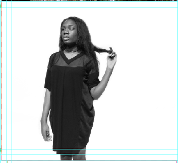
We then worked specifically upon the placement of the dots, so that they did not reveal too much of the artists but also showed that they were one male and one female. We also played around with colour, deciding that black and white fitted in better when reinserted onto the full album cover
 |
| The first draft of the final cover |
After substituting one of the images for a plain logo to improve branding and make the album more identifiable, the album cover was complete.


No comments:
Post a Comment