After reviewing and comparing some of the album covers of artists currently in the top 10 with those of my favourite artists, I decided that in order to be successfully visually appealing, the image must be high definition, and either hyper colourful, or as many recent album covers have seemed to do, present an analog image of the artist in a white room or a recognisable setting.
 |
| Talking Heads/Remain in Light (1980)/New-wave/W.B. Records |
I particularly like the Talking Heads-'Remain in light' Album cover as it is an iconic image with a story behind commonly unnoticed detail. The image was created by bassist Tina weymouth- she used red pixel to distort the faces of the portraits to create masks and 'obliterate their identity'- in contrast with the happy title of the album. I feel that the use of masking over a single portrait of the artist as a child could be an effective and unique album cover.
 |
Ed Sheeran- X (2014)/Pop-Acoustic/Atlantic
|
| I have noticed from viewing the charts that it is also currently quite popular to create a very minimalistic album cover- for examples, Ed Sheeran's chart topping album 'X' uses a simple, green canvas style background, with the letter 'X' written on top in a paint-style font. This theme is successful in reflecting the artist's own style,as his previous album was also short-titled'+', therefore there is no need to write his name on it. |

Similarly, electronic artist the XX use a minimalistic X symbol on all of their artwork and have built up an identity around it. Both their self titled debut album and their most recent album bear the same symbol, however, their coexist album uses an oil-spill style effec, which i think I could incorporate onto my cover- for example, if the artist I envisage was named victor, their album cover could be a simple'V'.
 |
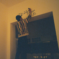
| Jesse James Solomon- JFSE E.P. /Unsigned/Rap |
I like the JFSE E.P. cover as I think that the use of photgraphjy is very creative- although the retro, analog-style shot only reveals the back of the artist, the fact that he is graffitiing/ writing his name on a wall reveals who the artist is. Furthermore, the use of a low angle shot shows who the artist is, with the image of graffiti reflecting the urban image/ persona associated with the uk rap/ grime genre.
Sam Smith's 'In the lonely hour' is also a very good example of using a simple shot of the artist to reflect the genre, mood and style of the artist, with this album, we see the stylish solo artist looking down into his lap, with his hands in a prayer position and his eyes closed. This image of a vulnerable, sad and faithful artist works alongside the title of the album- reflecting the 'lonely hour' and revealing the theme of his music. If i were to use this style of photographic cover, I would certainly draw influence from the angle and lighting of the shot.

 Similarly, electronic artist the XX use a minimalistic X symbol on all of their artwork and have built up an identity around it. Both their self titled debut album and their most recent album bear the same symbol, however, their coexist album uses an oil-spill style effec, which i think I could incorporate onto my cover- for example, if the artist I envisage was named victor, their album cover could be a simple'V'.


No comments:
Post a Comment